Watercolor painting is a beautiful and expressive art form known for its transparency and luminosity. At the heart of creating stunning watercolor artworks lies an understanding of color theory. In this guide, we will delve into the world of color theory in watercolor painting, exploring how to mix and blend colors effectively to bring your paintings to life.
The Basics of Color Theory:
Color theory is the foundation of all visual arts. It’s the science and art of using colors and their interactions to create appealing and harmonious compositions. In watercolor painting, understanding color theory is crucial for achieving the desired visual effects and emotional impact in your artwork.
The Color Wheel:
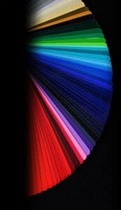
The color wheel is a fundamental tool in understanding color theory. It consists of primary, secondary, and tertiary colors. Primary colors (red, blue, and yellow) cannot be created by mixing other colors and are used to create all other colors. Secondary colors (green, orange, and purple) are formed by mixing equal parts of two primary colors. Tertiary colors are created by mixing a primary color with a neighboring secondary color.
Color Properties:
There are three main properties of color that you should understand in watercolor painting:
- Hue: Hue refers to the pure color itself, such as red, blue, or green.
- Value: Value is the lightness or darkness of a color. In watercolor, you achieve different values by controlling the concentration of pigment and the amount of water.
- Saturation: Saturation, also known as intensity or chroma, refers to the purity of a color. A highly saturated color is pure, while a desaturated color is more muted.
Mixing Colors:
To create a wide range of colors in watercolor painting, you’ll need to master color mixing. Here are some tips to get you started:
- Use a Limited Palette: Start with a limited palette of primary colors (red, blue, and yellow) and learn to mix all other colors from these primaries. This approach helps you understand color relationships better.
- Keep a Mixing Chart: Create a mixing chart that shows how different combinations of your primary colors produce secondary and tertiary colors. This chart is a handy reference tool.
- Start with Light Colors: When mixing colors, begin with the lightest color and gradually add small amounts of the darker color until you achieve the desired hue and value.
- Use a Clean Palette and Brushes: To avoid unintentional color contamination, keep your palette and brushes clean. Rinse your brushes thoroughly between color changes.
- Practice Gradual Washes: Gradual washes involve transitioning from one color to another smoothly. Practice creating gradients by blending two colors while they are both wet on the paper.
Blending Colors:
Blending is a key technique in watercolor painting. It allows you to create smooth transitions between colors and achieve various effects. Here’s how to approach blending:
- Wet-on-Wet: Apply wet paint to a wet surface. This technique results in soft, diffused edges and is great for creating atmospheric effects.
- Wet-on-Dry: Apply wet paint to a dry surface. This technique gives you more control and produces crisper edges.
- Dry Brush: Use a nearly dry brush to create texture and add details. Dry brushing is excellent for creating rough surfaces or fine lines.
Understanding Color Temperature:
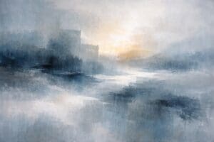
In watercolor painting, color temperature plays a significant role. Warm colors (red, orange, yellow) advance and can create a sense of energy and warmth, while cool colors (blue, green, purple) recede and can evoke calmness and depth. Understanding how to use color temperature effectively can add depth and mood to your artwork.
Complementary Colors:
Complementary colors are pairs of colors that are opposite each other on the color wheel (e.g., red and green, blue and orange, yellow and purple). When placed next to each other, complementary colors create contrast and vibrancy. You can use complementary colors to create focal points and make your paintings more dynamic.
Analogous Colors:
Analogous colors are colors that are adjacent to each other on the color wheel (e.g., blue, green, and yellow). Using analogous colors in your compositions creates harmony and a sense of unity.
Color Harmony and Emotion:
Different color combinations can evoke specific emotions in your artwork. For example, warm colors like reds and oranges can convey passion and excitement, while cool colors like blues and greens can evoke tranquility and calmness. Consider the emotional impact you want to achieve when selecting your color schemes.
External Resources for Further Learning:
Sharing Your Colorful Creations:
Once you’ve grasped the fundamentals of color theory in watercolor painting, it’s time to unleash your creativity. Share your vibrant and harmonious artworks with the world, and consider showcasing them in the diverse collection of art at Irish Art Mart.
Mastering color theory in watercolor painting is an ongoing journey. With practice, experimentation, and a keen eye for color relationships, you’ll develop the skills to create captivating and emotionally resonant artworks.
Disclaimer: The views and opinions expressed in this article do not necessarily reflect the official policy or position of Irish Artmart.
Explore Original Irish Art
Discover original Irish paintings, prints, and commissions from talented artists across Ireland.
Browse Art