Understanding Colour Theory: A Friendly Guide for New Painters
Colour is one of the most powerful tools an artist has — it sets mood, guides the viewer’s eye, and brings your artwork to life. But for beginners, colour theory can feel overwhelming. This friendly guide breaks it down into simple, practical steps you can start using in your paintings today.
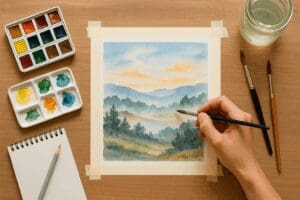
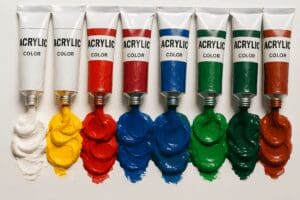
Whether you work in acrylic, watercolour, oils, or mixed media, understanding how colours interact will help you paint more confidently and develop your own unique style.
🎨 What Is Colour Theory?
Colour theory is the study of how colours mix, match, and contrast — and how we perceive them. It helps artists:
-
Choose harmonious colour palettes
-
Create mood and atmosphere
-
Add depth and contrast
-
Avoid muddy colours
-
Make compositions feel balanced
At its core, colour theory is about relationships — and once you understand those relationships, your artwork becomes much easier to control.
🌈 The Colour Wheel: Your Best Friend
The colour wheel is the foundation of colour theory. It shows how colours relate to each other. Here are the basics:
Primary Colours
-
Red
-
Blue
-
Yellow
These cannot be mixed from other colours.
Secondary Colours
Created by mixing two primaries:
-
Green (yellow + blue)
-
Orange (yellow + red)
-
Purple (red + blue)
Tertiary Colours
A mix of a primary and a secondary, such as:
-
Red-orange
-
Yellow-green
-
Blue-violet
Understanding these relationships makes choosing palettes so much easier.
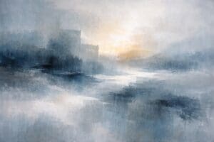
🎨 Warm vs Cool Colours
Warm colours — reds, oranges, yellows
Feel energetic, bold, and inviting.
Cool colours — blues, greens, purples
Feel calm, soothing, and peaceful.
Tip:
Mixing warm and cool colours without planning can quickly lead to muddy results. Try to choose one temperature family as your dominant palette when starting out.
🎯 Colour Harmony: Easy Palettes for Beginners
Here are simple palette formulas based on the colour wheel. They always work — perfect for new painters.
1. Complementary Colours
Opposites on the wheel (e.g., blue + orange).
High contrast. Vibrant. Eye-catching.
2. Analogous Colours
Colours beside each other (e.g., green + yellow + blue).
Calm. Natural. Great for landscapes.
3. Triadic Colours
Three colours evenly spaced (e.g., red + blue + yellow).
Balanced, playful, dramatic.
4. Monochromatic
Different values of a single colour.
Minimal, elegant, great for mood studies.
✏️ Value & Tone: The Secret to Professional-Looking Art
Even with perfect colour choices, a painting can feel flat if the values (light and dark) aren’t balanced.
Value = how light or dark a colour is
Tone = how muted or vibrant it is
Quick exercise:
Take a photo of your painting and convert it to black and white. If everything looks the same shade of grey, you need more contrast.
🧪 Why Colours Turn Muddy (and How to Avoid It)
Muddy colours happen when:
-
Opposites are mixed unintentionally
-
Paint is overworked
-
Too many layers mix on the canvas
-
Too many pigments are blended at once
Tip:
Clean your brush or water regularly. “Dirty” tools are the #1 cause of accidental mud for beginners.
🖌️ Practical Colour Exercises for Beginners
Try these simple, fun exercises to build confidence:
1. Create Your Own Colour Wheel
Mix your primaries into secondaries and tertiaries.
2. Paint a 3-Colour Mini Landscape
Pick one dominant colour, one support colour, and a small accent.
3. Make a Value Scale
Take any hue and mix a 5- or 7-step gradient from dark to light.
4. Try a Monochrome Study
Choose one colour and paint an entire object or scene.
These exercises build muscle memory fast.
🖼️ Using Colour to Set Mood
Colour triggers emotion. Here are simple examples you can use:
-
Blues + greens → calm, meditative, natural
-
Reds + oranges → energy, warmth, passion
-
Purples → mystery, creativity
-
Yellows → optimism, light, joy
-
Earth tones → grounded, cosy, rustic
Ask yourself:
“What do I want the viewer to feel?”
Let that guide your palette.
🛒 Ready to Put It Into Practice? Explore Colourful Art on Irish Artmart
Browse vibrant original art from Irish artists across every medium — and discover pieces full of colour, emotion, and personality.
Or if you’re an artist ready to start selling your colourful creations online, you can join the Irish Artmart community today and open your own store.
- Explore more about painting and creativity at Irish Artmart.
- *For collaborations, art features, or inquiries, please contact us at [email protected]. Don’t forget to follow us on Instagram, Facebook, Twitter.
- Disclaimer: The views and opinions expressed in this article do not necessarily reflect the official policy or position of Irish Artmart.
- Irish Artmart – Your Gateway to Artistic Excellence.
Explore Original Irish Art
Discover original Irish paintings, prints, and commissions from talented artists across Ireland.
Browse Art