Abstract Winter Art: A Step-by-Step Tutorial to Translate Mood into Shape & Colour
Winter in Ireland has its own language: low light, soft skies, wet pavements, sea winds, fog rolling across fields, and those rare moments when the sunset flares like copper behind grey clouds. Even if you never paint a single snowflake or traditional winter landscape, you can still create work that feels like winter.
That’s where abstract winter art shines.
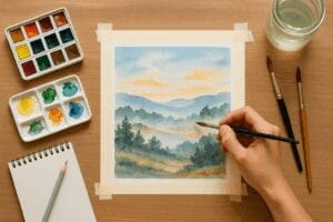
Instead of painting “a place,” you’ll paint a mood—using shape, colour, value, edge, and texture to suggest cold air, quiet, distance, and light. This tutorial is designed for beginners and experienced artists alike, and it’s flexible across mediums (acrylic, oil, gouache, watercolour, inks, collage, mixed media).
By the end, you’ll have at least one finished abstract winter piece—and a repeatable process you can use to build a winter series for the season ahead.
What You’ll Make
You’ll create an abstract winter artwork in 7 clear phases:
-
Gather winter mood references
-
Choose a “winter feeling” and 3 keywords
-
Build a winter palette
-
Design a simple shape map
-
Block in big shapes (values first)
-
Create atmosphere with edges + layers
-
Finish with texture, contrast, and focal control
You’ll also get:
-
winter palette recipes
-
shape ideas (geometric or organic)
-
composition templates
-
finishing checklists
-
optional variations for different mediums
Materials
Use what you have. Keep it simple.
Basic materials (pick your medium)
-
Surface: paper, canvas, panel, or board
-
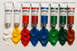
Paint: acrylics or oils (or gouache/watercolour/ink)
-
Brushes: one big, one medium, one small
-
Palette knife / old card (optional, great for texture)
-
Water jar / solvent depending on medium
-
Rag / paper towels
-
Pencil + eraser
-
Masking tape (optional for crisp shapes)
-
White + black (or Payne’s Grey) for value control
Optional extras (nice but not required)
-
Charcoal / graphite sticks for fast marks
-
Pastels or oil sticks for atmospheric layers
-
Collage papers (old maps, book pages, tissue, handmade paper)
-
Texture mediums (acrylic gel, modelling paste)
-
Metallic accent (a touch of gold/pearl can feel like winter light—use sparingly)
Step 1: Collect Winter Mood References (10 minutes)
You’re not looking for “pretty photos.” You’re looking for winter cues:
-
fog, mist, drizzle, sea spray
-
bare trees, hedgerows, stone walls
-
overcast skies, low sun, short days
-
streetlights reflected on wet ground
-
cold coastal greys, deep greens, muted browns
Quick reference options
-
Your own phone photos (ideal)
-
A short walk snapshot: shoreline, park, canal, estate road
-
Screenshot 3–5 images you love (no need to copy them)
Tip: Choose references with strong value structure (light/dark). Abstract art becomes powerful when your values are intentional.
Step 2: Choose a Winter Feeling + 3 Keywords (5 minutes)
Pick one “winter feeling” to guide the piece. Examples:
-
Quiet
-
Distance
-
Stormy
-
Stillness
-
Frosted light
-
Coastal cold
-
Twilight
Now write three keywords that describe what you want the viewer to feel.
Examples:
-
Quiet: soft / spaced / muted
-
Stormy: sharp / heavy / rushing
-
Twilight: glowing / deep / hush
-
Coastal cold: windy / salty / pale
These keywords will decide your:
-
palette choices
-
shapes (hard vs soft)
-
edges (crisp vs blurred)
-
texture (smooth vs rough)
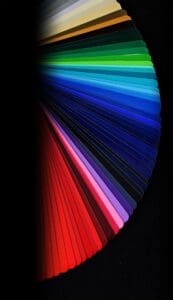
Step 3: Build Your Winter Palette (15–20 minutes)
Winter palettes don’t have to be “all grey.” The trick is controlled colour temperature and restrained saturation.
Choose one palette structure
Pick one of these (simple and reliable):
A) Monochrome + Accent
-
3–5 tones of one colour family + one small accent
-
Example: blue-greys + tiny warm ochre
B) Limited Triad (Muted)
-
3 main colours, mixed down with white/neutral
-
Example: ultramarine + burnt umber + titanium white
C) Warm/Cold Split (Winter Light)
-
mostly cool neutrals, plus one warm “light” note
-
Example: Payne’s grey world + pale peach highlight
Winter palette recipes (pick one)
Palette 1: Irish Coastal Grey
-
Payne’s Grey (or mix ultramarine + burnt umber)
-
Titanium White
-
Raw Umber
-
A hint of Sap Green (or Viridian)
Optional accent: Naples Yellow (tiny)
Palette 2: Fog + Copper Sun
-
Ultramarine Blue
-
Burnt Umber
-
Titanium White
-
Yellow Ochre
Accent: Burnt Sienna (very small)
Palette 3: Frosted Violet
-
Ultramarine
-
Alizarin Crimson (or Quinacridone Magenta)
-
White
-
Neutral grey
Accent: a pale warm grey (grey + ochre)
Palette 4: Winter Woodland
-
Sap Green
-
Burnt Umber
-
White
-
Payne’s Grey
Accent: a muted red-brown (for leafless branches vibe)
Make a mini “palette strip”
On scrap paper, paint:
-
your darkest dark
-
mid dark
-
mid
-
light
-
brightest highlight
Then test: can you create a calm gradient? If yes, you’re ready.
Step 4: Design a Simple Shape Map (10–15 minutes)
This is where your abstract piece gets structure.
Choose your abstraction style
Geometric abstraction: rectangles, blocks, bands, grids, architecture-like shapes
Organic abstraction: soft blobs, wind shapes, fog forms, water movement
Hybrid: geometric base + organic overlays (often the best of both)
Pick a composition template (easy wins)
Choose one:
1) Horizon bands
-
3–5 horizontal bands (sky / distance / land / foreground)
-
Great for winter landscapes without being literal
2) Vertical “trees” / pillars
-
repeated verticals suggest bare trees, posts, rain streaks
3) Diagonal wind
-
sweeping diagonals create movement and storm energy
4) Asymmetrical block + breathing space
-
one strong shape cluster on one side, open quiet space on the other
Sketch a 30-second map
Lightly draw:
-
1–2 large shapes
-
2–4 medium shapes
-
a few small shapes (optional)
Rule of thumb:
Big shapes = mood.
Small shapes = detail.
Too many small shapes early = noisy painting.
Step 5: Block In Big Shapes (Values First) (30–60 minutes)
This is the core painting stage.
5.1 Start with a toned ground (optional but powerful)
Choose a mid-tone (warm grey or cool grey) and thinly cover the surface.
Why it helps:
-
instantly harmonises the work
-
makes lights and darks easier to judge
-
feels more “winter” than a white blank surface
5.2 Establish your darkest darks
Place 2–3 areas of dark value. Don’t outline—mass them in.
Examples:
-
a deep band at the bottom (foreground weight)
-
a dark block off-centre (anchor)
-
a cluster of dark marks (storm core)
5.3 Add mid-tones and build structure
Now block the medium shapes. Keep your brushwork simple.
Aim:
You should be able to squint and still “read” the painting.
5.4 Save your lightest lights
Hold back the brightest highlight until later. Winter art becomes luminous when highlights are rare and intentional.
Step 6: Create Atmosphere with Edges + Layers (30–90 minutes)
This is where it becomes winter, not just abstract shapes.
6.1 Control your edges (winter loves soft edges)
Choose 2 edge types:
-
soft/blurred edges = mist, distance, quiet
-
hard edges = crisp cold air, structural clarity, geometry
-
broken edges = wind, rain, movement
Simple edge plan:
-
70% soft
-
20% hard
-
10% broken
If everything is hard, it looks “graphic.”
If everything is soft, it looks “muddy.”
The mix creates atmosphere.
6.2 Add a glaze or veil (fog effect)
Thin paint (or use medium) and sweep a semi-transparent layer across parts of the piece.
Where to veil:
-
across the horizon area
-
over busy sections to quiet them
-
across transitions to create depth
6.3 Suggest winter motion (without literal marks)
Try one:
-
vertical drips (rain)
-
dry brush scumbling (wind blur)
-
palette knife drag (sea spray / frost scrape)
-
scribbled graphite lines (bare branches energy)
Keep it subtle. A little goes a long way.
Step 7: Finishing Moves (20–45 minutes)
Now you’ll bring it to completion with contrast, focal control, and restraint.
7.1 Add one “winter light” moment
Pick ONE place to add a controlled light accent:
-
pale warm glow (low sun)
-
cool icy highlight
-
small metallic shimmer (very tiny)
Think “a gap in cloud,” not “a spotlight.”
7.2 Create a focal area (even abstract art needs hierarchy)
Choose a focal zone and give it:
-
slightly sharper edges
-
slightly stronger contrast
-
slightly richer colour
Then quiet the rest:
-
soften edges
-
glaze over too-busy areas
-
reduce contrast elsewhere
7.3 Check values with the squint test
Stand back. Squint.
-
Do you have clear darks and lights?
-
Is there a dominant mood?
-
Does anything shout that shouldn’t?
If something is distracting, it’s usually:
-
too bright
-
too sharp
-
too saturated
-
too detailed
7.4 Stop at 90%
Many abstract works get overworked in the final 10%.
If it feels alive, cohesive, and winter-quiet (or winter-stormy), step away.
Common Mistakes (and Fast Fixes)
“It looks flat.”
Fix: Add value separation. Deepen one dark area and lift one light area.
“It’s too busy.”
Fix: Glaze a veil over 30–50% of the work. Simplify.
“It looks muddy.”
Fix: Reduce mixing on the surface. Mix cleaner piles. Add a few crisp shapes.
“It doesn’t feel like winter.”
Fix: Shift temperature cooler overall and add one restrained “winter light” highlight.
Variations by Medium
Acrylic
-
Work in fast layers
-
Use glazing medium for fog
-
Try scraping back (squeegee/card) for winter texture
Oil
-
Build soft transitions easily
-
Use scumbling for mist
-
Let layers dry for cleaner veils
Watercolour / Gouache
-
Watercolour: reserve whites, layer slowly
-
Gouache: use opaque lights late
-
Dry brush textures mimic frost beautifully
Mixed Media / Collage
-
Add tissue or thin paper as “fog layers”
-
Use graphite/charcoal marks as winter branch energy
-
Tear edges for organic winter movement
Turn This Into a Winter Series (Great for January)
A series sells well because buyers love cohesive bodies of work.
Try a “Winter Mood Series” of 4–8 pieces:
-
Fog
-
Coastal Cold
-
Twilight
-
Storm
-
Stillness
-
Low Sun
Keep the same:
-
format size
-
palette family
-
shape language
Change:
-
focal point
-
edge quality
-
contrast level
Presentation Tips for Irish Artmart Artists
If you plan to list this work on Irish Artmart, a few quick upgrades make a big difference:
-
Photograph in soft daylight near a window (avoid harsh overhead lighting)
-
Include a close-up showing texture (winter textures are a selling point)
-
Describe the mood and materials clearly:
-
“Inspired by winter coastal evenings in Ireland…”
-
“Layered glazes and scraped textures to suggest mist and wind…”
-
Buyer-friendly keywords to naturally include in your description:
-
abstract winter art
-
contemporary abstract painting
-
Irish-inspired atmosphere
-
coastal colour palette
-
geometric abstraction
-
moody minimalist art
Quick 10-Minute Practice Exercise (Optional)
Before your final piece, do this warm-up:
-
Make 3 tiny thumbnails (postcard size)
-
Use only 3 values: dark / mid / light
-
Add one small warm accent on each
Pick the best and scale it up.
This simple exercise speeds up decision-making and prevents overworking.
Final Checklist (Before You Call It Done)
-
Does it communicate one winter mood clearly?
-
Are your values intentional (dark, mid, light)?
-
Do you have edge variety (soft + hard + broken)?
-
Is there one controlled “winter light” moment?
-
Is there a focal area (not everywhere)?
-
Have you left breathing space?
If you can tick 4–6 of these, you’ve made a strong piece.
Set up your store, list your work, and focus on the moments that matter: making art and building genuine relationships with collectors.
*For collaborations, art features, or inquiries, please contact us at [email protected]. Don’t forget to follow us on Instagram, Facebook, Twitter.
Disclaimer: The views and opinions expressed in this article do not necessarily reflect the official policy or position of Irish Artmart.
Irish Artmart – Your Gateway to Artistic Excellence.
Explore Original Irish Art
Discover original Irish paintings, prints, and commissions from talented artists across Ireland.
Browse Art