Color Theory in Cityscape painting: How to Use Colors to Create Atmosphere
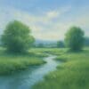
Cityscapes offer an extraordinary canvas for artists looking to capture the dynamic essence of urban environments. One of the most potent tools at your disposal is color, which has the power to influence mood, direct viewer attention, and evoke specific emotional responses. This guide explores how you can effectively use color theory to create vivid, atmospheric cityscapes, from the warm glow of twilight to the electric pulse of neon-lit streets.
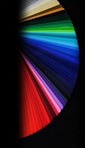
Understanding Basic Color Theory
Before diving into specific examples, it’s essential to have a clear understanding of basic color theory:
- Primary Colors: Red, blue, and yellow—these colors can’t be created by mixing others.
- Secondary Colors: Orange, green, and purple, formed by mixing primary colors.
- Tertiary Colors: Result from mixing primary and secondary colors, e.g., blue-green or red-orange.
Familiarity with the color wheel and concepts like complementary colors (opposite on the wheel), analogous colors (next to each other), and triadic colors (equally spaced) can significantly enhance your artistic choices.
Capturing Different Moods with Color
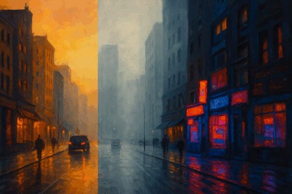
1. Golden Hour: Warmth and Nostalgia
The golden hour, occurring just after sunrise or before sunset, bathes cityscapes in soft, warm tones. Incorporating yellows, oranges, and reds can evoke feelings of warmth, nostalgia, and tranquillity. To capture this, apply warm hues predominantly in the sky and reflective surfaces like glass windows or wet streets. Contrasting these warm tones with subtle cool shadows, typically blues or purples, adds depth.
Tip: Use a limited warm palette like Cadmium Orange, Yellow Ochre, and Alizarin Crimson combined with hints of Cerulean Blue or Ultramarine for shadows.
2. Overcast Days: Cool Calmness
Overcast skies create a serene, muted atmosphere. This setting calls for a palette dominated by cool grays, blues, and muted greens. Employing these tones uniformly creates harmony but consider adding subtle warm colors to enhance focal points and prevent monotony.
Tip: Mix Ultramarine Blue, Burnt Sienna, and Titanium White to achieve a versatile range of grays and subtle browns.
3. Neon-lit Nights: Vibrant Energy
Night cityscapes, illuminated by neon signs and street lights, provide opportunities to experiment with vibrant, saturated colors. Contrast dark, muted backgrounds with bright accents of neon pinks, blues, greens, and purples. Strong contrasts and reflections on wet surfaces intensify the scene’s dynamism.
Tip: Layer neon colors over darker shades, using high-pigment acrylics or oils to achieve brightness and luminosity.
Techniques for Applying Color
- Layering and Glazing: Gradually layering translucent colors enhances depth, ideal for atmospheric effects like fog or distant lights.
- Impasto: Thick, textured application of paint can capture the roughness of urban textures and vibrancy of neon lights.
- Dry Brushing: Useful for creating textures and subtle highlights, particularly effective for capturing concrete, brickwork, or distant objects.
Practical Examples and Inspirations
- Claude Monet’s London Series: Monet expertly captures London’s foggy atmosphere using muted blues, grays, and subtle warmth to suggest time and weather variations (Explore Monet’s London Series).
- Edward Hopper’s Night Scenes: Known for his evocative urban paintings, Hopper uses strong contrasts and simplified color schemes to create mood and isolation (Discover Edward Hopper).
Tips for Beginners
- Start Simple: Begin with monochromatic studies to master tonal variations before introducing more colors.
- Observe Real Life: Spend time observing cityscapes at different times and conditions, taking photos for reference.
- Limit Your Palette: Initially restrict your palette to a few colors to maintain harmony and focus.
Conclusion
Mastering color theory in cityscapes allows artists to capture not just the visual essence but also the emotional resonance of urban life. Whether depicting the serene calmness of dawn, the melancholy of rainy afternoons, or the energetic nightlife, the right colors can profoundly affect the viewer’s experience.
External Resources
- Color Theory for Artists – Draw Paint Academy
- Urban Sketchers – Inspiration from global urban artists
*For collaborations, art features, or inquiries, please contact us at [email protected]. Don’t forget to follow us on Instagram, Facebook, Twitter.
Disclaimer: The views and opinions expressed in this article do not necessarily reflect the official policy or position of Irish Artmart.
Irish Artmart – Your Gateway to Artistic Excellence.
Explore Original Irish Art
Discover original Irish paintings, prints, and commissions from talented artists across Ireland.
Browse Art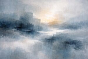

Loved this article! Really helpful tips on using colors—I can’t wait to try them out in my cityscapes. Thanks!