Color Theory in Practice: How to Use Color to Create Mood and Impact
Color is more than just a visual element; it’s a powerful tool that artists can wield to evoke emotions, create depth, and establish harmony in their work. Understanding color theory allows artists to harness the emotional and psychological effects of color, transforming a simple piece into a profound experience. In this post, we’ll explore the principles of color theory and provide practical exercises to help you effectively apply these concepts in your art.
Understanding Color Theory
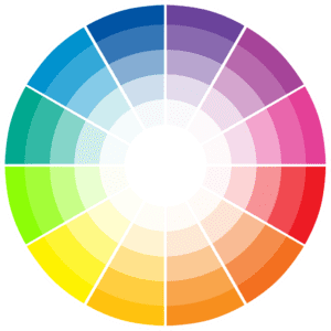
The Color Wheel
At the core of color theory is the color wheel, which is a circular diagram representing colors arranged according to their chromatic relationship. The primary colors—red, blue, and yellow—cannot be made by mixing other colors. Secondary colors (green, orange, and purple) are created by mixing primary colors. Tertiary colors are formed by mixing a primary color with a secondary color.
Color Properties
- Hue: The name of the color (e.g., red, blue).
- Saturation: The intensity or purity of the color; a highly saturated color appears vivid, while a less saturated color looks more muted.
- Value: The lightness or darkness of a color. Adding white to a color creates a tint, while adding black creates a shade.
Color Harmony
Color harmony refers to a pleasing arrangement of colors that creates a sense of balance and unity in a piece. Here are some common color schemes:
- Monochromatic: Variations in lightness and saturation of a single color.
- Analogous: Colors that are next to each other on the color wheel (e.g., blue, blue-green, and green).
- Complementary: Colors that are opposite each other on the color wheel (e.g., red and green).
- Triadic: Three colors that are evenly spaced around the color wheel (e.g., red, yellow, blue).
Creating Mood with Color
Colors can evoke specific feelings and set the mood of a piece. Understanding the psychological effects of colors is essential for artists looking to convey particular emotions:
- Warm Colors (Red, Orange, Yellow): These colors are associated with energy, warmth, and excitement. They can evoke feelings of passion and urgency.
- Cool Colors (Blue, Green, Purple): These colors are calming and serene, often associated with tranquility and introspection.
- Neutral Colors (Black, White, Gray): These colors can provide balance, but their meaning often depends on the colors they are paired with.
Practical Exercises
To apply these principles, here are some exercises you can try:
1. Color Mixing Exercise
Objective: Understand how to create different hues, tints, and shades.
Materials: Red, blue, and yellow paint; white and black paint; a palette; and a brush.
Steps:
- Start by mixing equal parts of two primary colors to create a secondary color (e.g., red + blue = purple).
- Experiment by adding white to create tints (e.g., light purple) and black to create shades (e.g., dark purple).
- Document your mixtures and the resulting colors in a sketchbook.
2. Using Complementary Colors
Objective: Learn how to create contrast and visual interest using complementary colors.
Materials: Paint in complementary color pairs (e.g., red and green, blue and orange).
Steps:
- Create a small painting or a series of color swatches using complementary colors.
- Observe how the colors interact and the mood created by their juxtaposition.
- Consider how you can use these colors in your future works.
3. Experimenting with Color Schemes
Objective: Discover how different color schemes affect the overall feel of your artwork.
Materials: A selection of colors from your palette.
Steps:
- Create three small compositions: one monochromatic, one analogous, and one triadic.
- Analyze the mood and depth of each piece. Note how the choice of colors alters the emotional response to the work.
- Share your findings with fellow artists for feedback.
Additional Resources
To deepen your understanding of color theory, here are some useful resources:
- Adobe Color Wheel: An interactive tool for exploring color combinations.
- Color Theory: A Guide for Artists: An in-depth look at color theory for artists.
- The Psychology of Color: Explore how different colors affect emotions and behavior.
Conclusion
Color theory is an essential aspect of creating impactful art. By understanding how to use color effectively, you can evoke emotions, create depth, and establish harmony in your work. The exercises outlined in this post are designed to help you experiment with color and discover new ways to enhance your artistic expression. Remember, practice is key; the more you experiment, the more you will develop your unique color palette and style.
By incorporating color theory into your artistic practice, you can elevate your work and connect more deeply with your audience. Dive into these exercises, share your experiences, and watch your artistry flourish!
*For collaborations, art features, or inquiries, please contact us at [email protected]. Don’t forget to follow us on Instagram, Facebook, Twitter.
Disclaimer: The views and opinions expressed in this article do not necessarily reflect the official policy or position of Irish Artmart.
Irish Artmart – Your Gateway to Artistic Excellence.
Tips to Express Your Creative Vision – Irish Artmart Podcast
Explore Original Irish Art
Discover original Irish paintings, prints, and commissions from talented artists across Ireland.
Browse Art